- This topic has 56 replies, 16,590 voices, and was last updated 17 years, 4 months ago by
Anonymous.
-
AuthorPosts
-
-
2008.10.31 at 10:23 pm #774
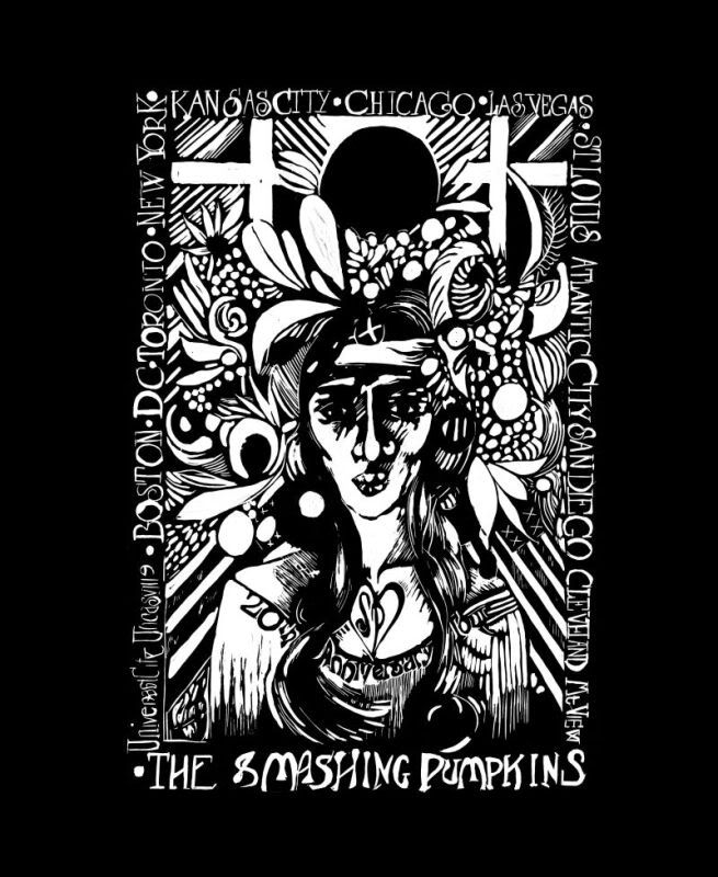
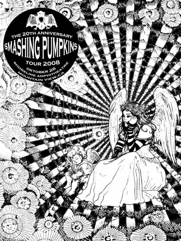
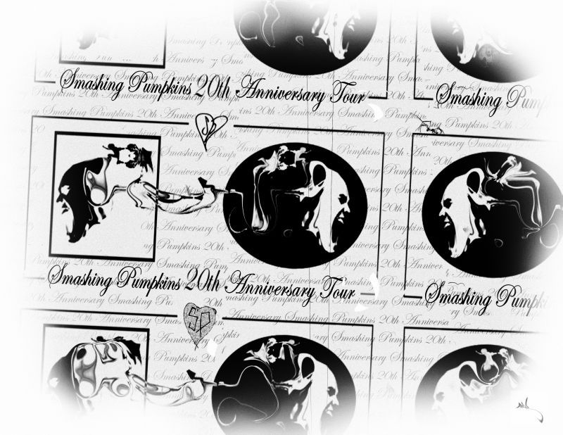
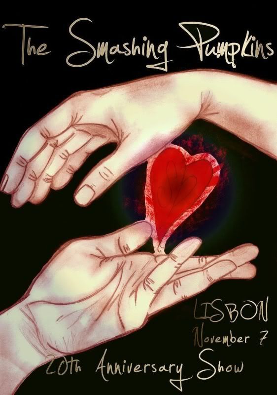
confuciousconfusingSpectatorPlease enjoy all of the entries in their entirety! They are presented in alphabetical order. The entries are listed in the following format:
Poster
Flyer
Backstage passes, iron-on badges, or stickers (3)
Bumpersticker
Shirt (front then back, if submitted)
Setlist
OtherKnow how much we enjoyed hosting this contest! These submissions are truly wonderful and everyone should be very happy with their contribution. We thank you dearly for making this contest a wonderful success!
-
2008.11.03 at 3:47 am #26204
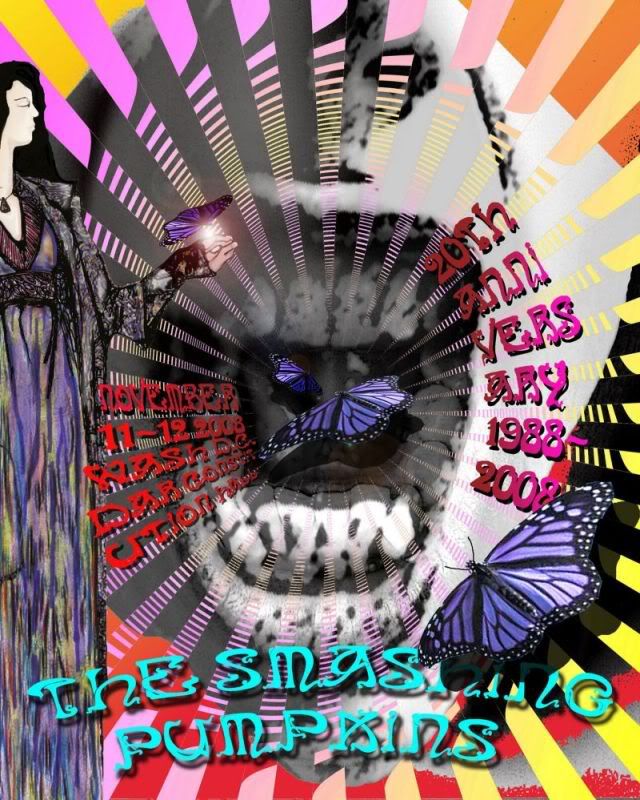
SPfreaksSpectatorabsinth (entry 1)
Note: This user submitted two posters, and a justification for such. We decided to judge these as a front and back, instead of disqualification.
-
2008.11.03 at 4:05 am #26205
SPfreaksSpectatorAdore34614 (entry 1)
-
2008.11.03 at 4:19 am #26206
SPfreaksSpectatorAlexHlavaty (entry 1)
-
2008.11.03 at 4:24 am #26207
SPfreaksSpectatorAmbrose (entry 1)
-
2008.11.03 at 4:35 am #26208
SPfreaksSpectatorApathyse (entry 1)
-
2008.11.03 at 4:43 am #26209
SPfreaksSpectatorApathyse (entry 2)
-
2008.11.03 at 4:50 am #26210
SPfreaksSpectatorApathyse (entry 3)
-
2008.11.03 at 5:03 am #26211
SPfreaksSpectatorbullettwoutbutterflywings (entry 1)
-
2008.11.03 at 5:10 am #26212
SPfreaksSpectatorbullettwoutbutterflywings (entry 2)
-
2008.11.03 at 5:25 am #26213
SPfreaksSpectatorDaisy_Divine (entry 1)
-
2008.11.03 at 5:31 am #26214
SPfreaksSpectatorDoubtful-Della (entry 1)
-
2008.11.03 at 5:36 am #26215
SPfreaksSpectatorDoubtful-Della (entry 2)
-
2008.11.03 at 5:42 am #26216
SPfreaksSpectatordouglas78 (entry 1)
-
2008.11.03 at 5:47 am #26217
SPfreaksSpectatorJai-Star (entry 1)
-
2008.11.03 at 5:51 am #26218
SPfreaksSpectatorJai-Star (entry 2)
-
2008.11.03 at 5:57 am #26219
SPfreaksSpectatorjconley78 (entry 1)
-
2008.11.03 at 6:01 am #26220
SPfreaksSpectatorJenn (entry 1)
-
2008.11.03 at 6:04 am #26221
SPfreaksSpectatorJenn (entry 2)
-
2008.11.03 at 6:17 am #26222
SPfreaksSpectatorJerf (entry 1)
-
2008.11.03 at 6:40 am #26223
SPfreaksSpectatorJerf (entry 2)
-
2008.11.03 at 6:46 am #26224
SPfreaksSpectatorKuumar & Riverandsky (entry 1)
-
2008.11.03 at 6:54 am #26225
SPfreaksSpectatornatascha (entry 1)
-
2008.11.03 at 7:06 am #26226
SPfreaksSpectatorOoAwAo0 (entry 1)
-
2008.11.03 at 7:18 am #26227
SPfreaksSpectatorPipoka (entry 1)
-
2008.11.03 at 7:23 am #26228
SPfreaksSpectatorReggaeluv2000 (entry 1)
-
2008.11.03 at 7:29 am #26229
SPfreaksSpectatorReggaeluv2000 (entry 2)
-
2008.11.03 at 7:34 am #26230
SPfreaksSpectatorReggaeluv2000 (entry 3)
-
2008.11.03 at 7:42 am #26231
SPfreaksSpectatorscotopic_lux (entry 1)
-
2008.11.03 at 7:49 am #26232
SPfreaksSpectatorsmassin (entry 1)
Note: This user has asked us to remove their submissions, which is a shame, as they were wonderful.
-
2008.11.03 at 7:58 am #26233
SPfreaksSpectatorCodie Blodgett (entry 1)
Note: This user’s entry was accidentally added out of alphabetical order.
-
2008.11.03 at 8:06 am #26234
SPfreaksSpectatorthrashingponies (entry 1)
Note: This user submitted all handmade items.
-
2008.11.03 at 8:10 am #26235
SPfreaksSpectatorTion (entry 1)
-
2008.11.03 at 8:14 am #26236
SPfreaksSpectatorwHiTe_sPyDeR_gRl (entry 1)
-
2008.11.03 at 8:20 am #26237
SPfreaksSpectatorzero_jme (entry 1)
-
2008.11.03 at 8:24 am #26238
SPfreaksSpectatorlunatwin (entry 1)
Note: This user submitted a handmade setlist.
-
2008.11.03 at 10:23 am #26239
ObscureDSpectatorDoubtful-Della (entry 1) —> your flyer is beautiful !
Doubtful-Della (entry 2) —> your second poster is amazing too !douglas78 —> great work, I like it
natascha —> wonderful poster, very oldschool
Pipoka —> your poster is n°1 for me

scotopic_lux —> I like the colors of your poster
Very very cool contest ! Thanks SPFreaks !
-
2008.11.03 at 11:26 am #26240
PipokaSpectatorThank you Obscured !!!!

There are very cool stuff ! i need to see it again but i like a lot of entries !

-
2008.11.03 at 2:13 pm #26241
TionSpectatormy favorite is/was from zero_jme

-
2008.11.03 at 2:33 pm #26242
Doubtful-DellaSpectatormy favorite is/was from zero_jme
[/quote:3fkqkl9e]
Tion, I love how you submitted your setlist! Very cool. Looks like the back of a CD -
2008.11.03 at 2:41 pm #26243
bullettwoutbutterflywingsSpectatorthere are so many good ones, natascha’s and zero_jme’s and pip’s were some of my faves.
but there were lots of great ones. i just really love the green on zero_ime’s.
-
2008.11.03 at 2:46 pm #26244
Doubtful-DellaSpectatorSorry I’m not commenting on everybody’s… I know that doesn’t seam fair of me.
Absinth- That design is so sharp. It looks completely professional. I love it.
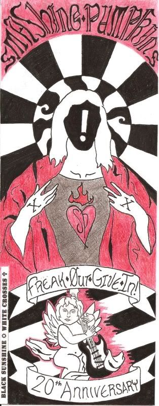
AlexHlavaty- I love the fact that it looks like colored pencils was your medium. That is such a difficult medium to work with. Your first poster with the Jesus ? cracked me up. I liked the \"out of the box\" style. The face card backstage pass rocked. If I were a rock star, I’d have that as my backstage pass
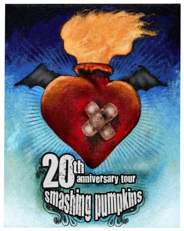
Douglas- I love the patch on the heart. Great poster!
Jai-Star I like your flier, how it’s the same image but one is monochromatic. The font you used was awesome, is it hand made?
Jenn- I think I had an epileptic seizure while scrolling
The colors and the lines really grab my attentionJerf- When I saw some the samples I thought these would take the cake, both the moon man and the cherub. My favorite part about the moon man is the stars that spell out the years. GREAT idea
Natacha- You already know I love your poster. I think your badges were the most unique out of all the entries
Pipoka- I want that T-shirt!
Tion- Very professional, would make a great album cover. The setlist rocked my socks in the area of design
Zero- When I saw the samples I thought this was the crispest and cleanest of all the entries. It makes me happy. I love the idea of the \"black sunshine\" \"white crosses\" on the back of your T-shirt. Great job, and congrats on second place. Congrats that PMM liked yours best, It really rocked. If I saw this poster at the concert, I’d buy it.
-
2008.11.03 at 3:03 pm #26245
PipokaSpectatori can send you the design if you want…
-
2008.11.03 at 5:01 pm #26246
Doubtful-DellaSpectatori can send you the design if you want…
[/quote:23u0f8cw]We should find out how to get trade mark permission from Smashing Pumpkins to use their band name/tour dates to sell fan art and then upload them to sell at places like CafePress
-
2008.11.03 at 7:10 pm #26247
ObscureDSpectatorCongratulation Doubtful-Della !
Do you think you’ll produce and sell some copies of your poster ? -
2008.11.03 at 8:42 pm #26248
SuperlordspamulonSpectatorWow. Some of these are absolutely amazing.
And being honest – the ones where MSPaint was used in lieu of Photoshop are quite hilarious. Sure, they had a great concept, but the execution tended to be quite amusing.
-
2008.11.03 at 9:37 pm #26249
bullettwoutbutterflywingsSpectatorwell superlord not everyone can have neat and expensive programs like that on thier computers.
-
2008.11.03 at 11:04 pm #26250
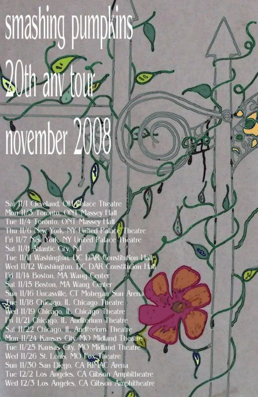
manillascissorKeymasterwell superlord not everyone can have neat and expensive programs like that on thier computers.[/quote:3iw6goja]
for the record, bullett, i really really liked your fence entry. i liked the gray, with the floral colors pronounced throughout.
-
2008.11.03 at 11:59 pm #26251
Doubtful-DellaSpectatorCongratulation Doubtful-Della !
Do you think you’ll produce and sell some copies of your poster ?[/quote:36vhkwq8]This has been discussed and details are being worked out as we speak. I’d have to get permission from the band to use their name in selling fan art. Keep an eye out on SPfreaks if everything works out
-
2008.11.04 at 12:04 am #26252
Doubtful-DellaSpectatorAnd being honest – the ones where MSPaint was used in lieu of Photoshop are quite hilarious. .[/quote:p1fap3tq]
I have to agree (Ms paint is sometimes a bad idea) and disagree. Not everybody can afford Photoshop, and not everybody wants or knows how to hack it. But at the same time there are free programs like Gimp out there that are nice, and cheaper versions of Photoshop (Elements) that range around $100.00. But even so, those take a while to learn. You could say that they could have just done it by hand and scanned it in (or taken a photo of it, or just mailed in the entry) But not everybody is comfortable with that or have art supplies just laying around the house.
In any case, they gave it their best shot, and that’s what counts.
In MS Paint’s defense…. have you ever seen this video? Shows you just how powerful that little program can be
[youtube]http://www.youtube.com/watch?v=uk2sPl_Z7ZU[/youtube]
-
2008.11.04 at 4:15 am #26253
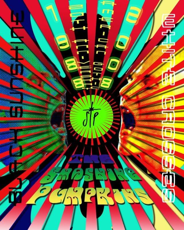
zero_jmeSpectatormy favorite is/was from zero_jme
[/quote:1dy8t9v4]there are so many good ones, natascha’s and zero_jme’s and pip’s were some of my faves.
but there were lots of great ones. i just really love the green on zero_ime’s.[/quote:1dy8t9v4]
Zero- When I saw the samples I thought this was the crispest and cleanest of all the entries. It makes me happy. I love the idea of the "black sunshine" "white crosses" on the back of your T-shirt. Great job, and congrats on second place. Congrats that PMM liked yours best, It really rocked. If I saw this poster at the concert, I’d buy it.[/quote:1dy8t9v4]
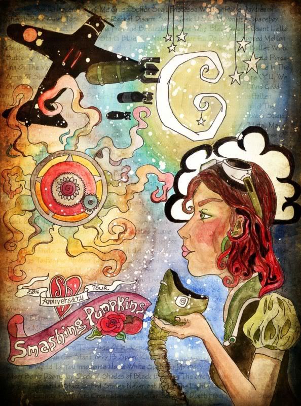
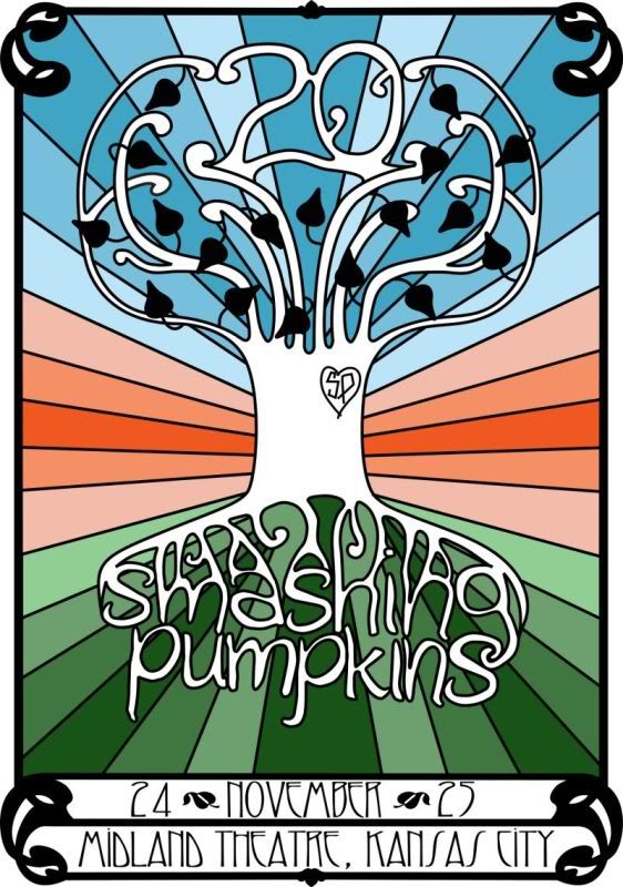
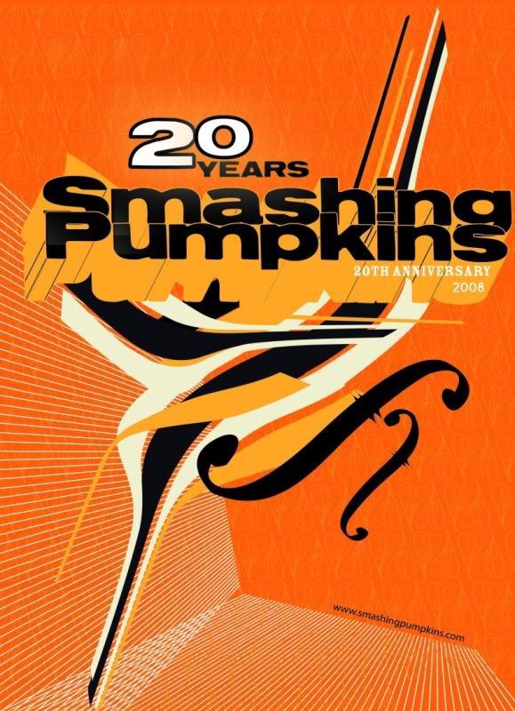
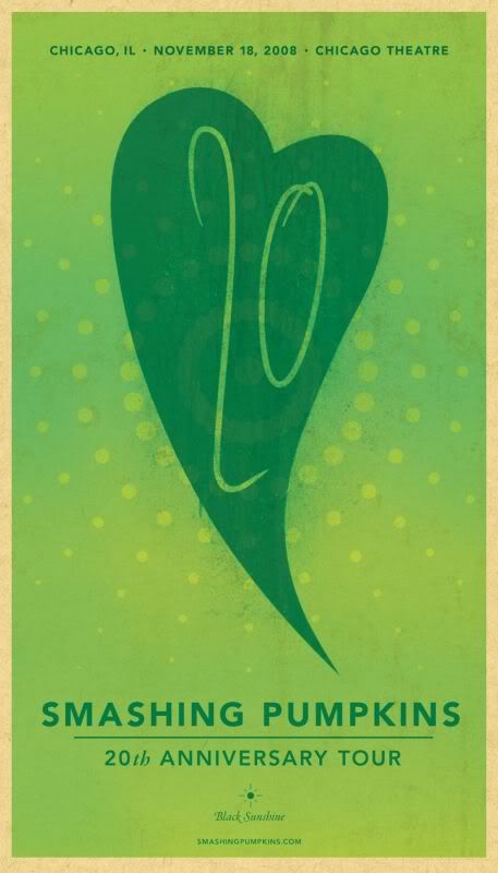
Thanks for all of the compliments! I genuinely appreciate it!
In order to explain some of my reasoning, here’s what I wrote up and sent in along with my submission to explain my design decisions:
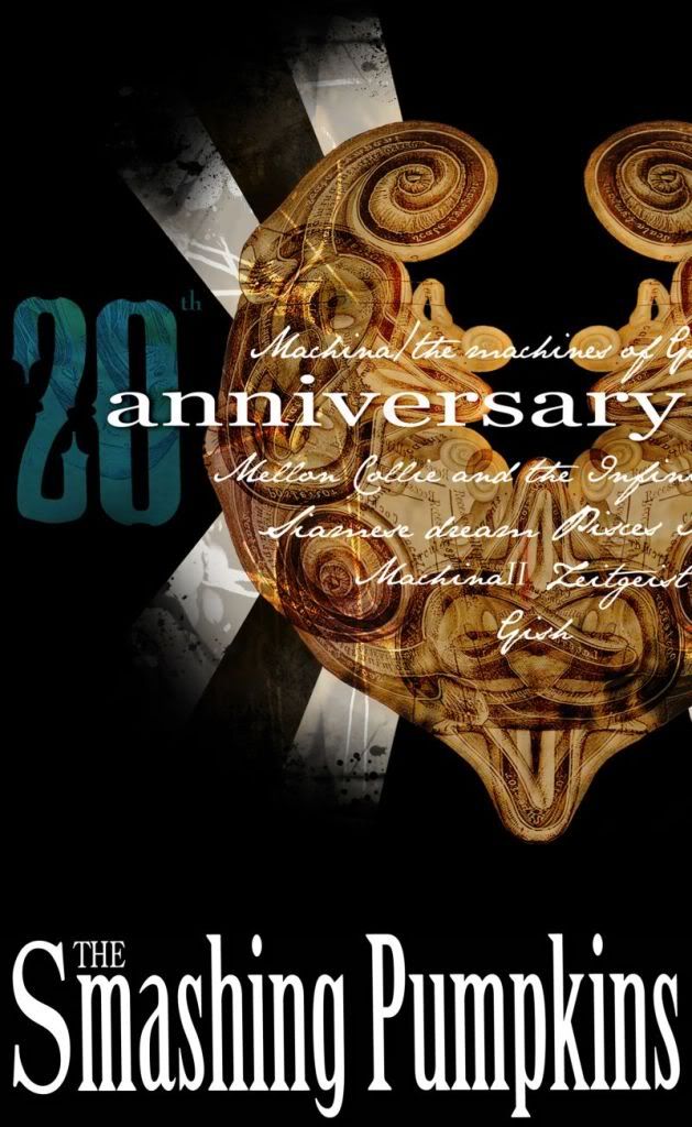
I chose to use green as the prominent color across the series because emerald is the traditional gemstone that represents a 20th anniversary (and green is its corresponding color). Though not a color widely used in the Pumpkins’ historical color palette, I thought green was an excellent choice due to the number of emotions it conveys. It often symbolizes well-being and harmony, which Billy and the Pumpkins seem to have found both spiritually and musically since the resurrection of SP. It also symbolizes growth and endurance, both of which are quite fitting given the current celebration of the band’s past, present, and future.
Since the Pumpkins’ style is constantly evolving with each release, I thought it was a good idea to infuse new ideas with traditional elements that are hallmarks of the Pumpkins’ presence. While the typography and design may be very clean and concise, I chose to give everything a worn, texturized look to convey the sense of history behind the Pumpkins, and the radiating circles are meant to represent celebration and growth. I also created icons for the Black Sunshine and White Crosses dates, which appear on the poster, flyer, iron-on badge, and t-shirt. And finally, rather than use a traditional SP logo, I chose to adapt it once more. The number 20 fit nicely in the modified heart shape, and I rendered it to look like Billy’s handwriting.
-
2008.11.04 at 6:39 am #26254
Doubtful-DellaSpectatorI rendered it to look like Billy’s handwriting.[/quote:1y8xg1tc]
Oooh I would have never thought to do that! Good one. Thanks for the behind the scenes look at your creations!
-
2008.11.04 at 8:53 am #26255
ObscureDSpectatorObscureD wrote:
Congratulation Doubtful-Della !
Do you think you’ll produce and sell some copies of your poster ?This has been discussed and details are being worked out as we speak. I’d have to get permission from the band to use their name in selling fan art. Keep an eye out on SPfreaks if everything works out [/quote:1z3ct89v]
I hope it’ll work ! I \"Adore\" your poster
-
2008.11.04 at 11:47 am #26256
PipokaSpectatorThanks for all of the compliments! I genuinely appreciate it!
In order to explain some of my reasoning, here’s what I wrote up and sent in along with my submission to explain my design decisions:
I chose to use green as the prominent color across the series because emerald is the traditional gemstone that represents a 20th anniversary (and green is its corresponding color). Though not a color widely used in the Pumpkins’ historical color palette, I thought green was an excellent choice due to the number of emotions it conveys. It often symbolizes well-being and harmony, which Billy and the Pumpkins seem to have found both spiritually and musically since the resurrection of SP. It also symbolizes growth and endurance, both of which are quite fitting given the current celebration of the band’s past, present, and future.
Since the Pumpkins’ style is constantly evolving with each release, I thought it was a good idea to infuse new ideas with traditional elements that are hallmarks of the Pumpkins’ presence. While the typography and design may be very clean and concise, I chose to give everything a worn, texturized look to convey the sense of history behind the Pumpkins, and the radiating circles are meant to represent celebration and growth. I also created icons for the Black Sunshine and White Crosses dates, which appear on the poster, flyer, iron-on badge, and t-shirt. And finally, rather than use a traditional SP logo, I chose to adapt it once more. The number 20 fit nicely in the modified heart shape, and I rendered it to look like Billy’s handwriting.[/quote:27plx9ja]
It looks very clean and professional.
you’re idea to put 20 instead of sp on the heart shape is amazing !
great job -
2009.03.19 at 10:29 am #26257
ArthurSpectatorI’m not sure if this was ever noticed… But the contest was mentioned on The Soul of Rock ‘n’ Roll website!

-
2009.03.19 at 11:07 pm #26258
blueczarinaSpectatorvery cool
-
2009.03.20 at 12:15 am #26259
AnonymousSpectatorvery cool Arthur
-
-
AuthorPosts
The forum ‘Archive Forum’ is closed to new topics and replies.